Winning Concepts
In 2022 Model Young Package challenged the designers from all around the world to create the best packaging based on the theme Food Is…
Food is our elixir of life - a daily companion - whose delight is increased by the packaging. Food packaging worthy of the 21st century should elevate the food experience to a new level, but at the same time it must meet a high standard when it comes to sustainability and ecology.
Can packaging elevate food into an even greater experience? How did the designers manage to complete this difficult task?
Unlimited Category
Concepts by university students and designers of any age.
Spa Wafers Package
Klára Kiesewetterová (CZE)
The package for spa wafers can be opened into two halves and the customer can use these two pieces as a simple holder for wafers. The package can be opened and closed multiple times thanks to a locker on the side of the box. The package catches the eye with the simple graphics and color palette. One-color graphic design is printed on recycled brown paper based on the flavor of the wafers inside.
The jury appreciates the unique style of opening and well thought out construction. The model also stands out by its hexagonal shape and well made graphic design.
Cat Cookies
Chiara Helységová (SVK)
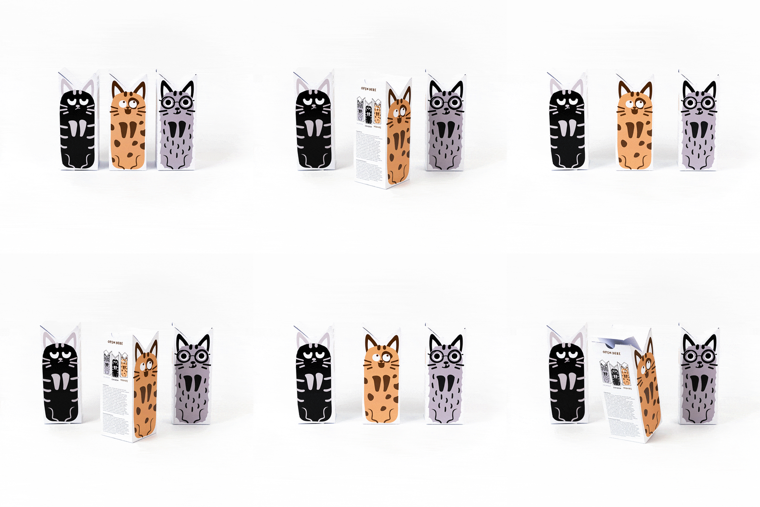
The Cat Cookies package reminds us of animals that need to eat as well. The model is a solution for a lack of visually attractive packages for pet food, specifically for cat cookies. Each of the packages in the trio points out the unique characteristics of cats. The box looks like a cat thanks to the shape of the cat's ears at the top.
The jury appreciates the graphics representing the cat’s playfulness and the corresponding shape of the model. The group of packages creates an interesting logical structure. It's overall a well thought out solution from construction to graphics.
No Shame!
Andrea Kováčová (SVK)
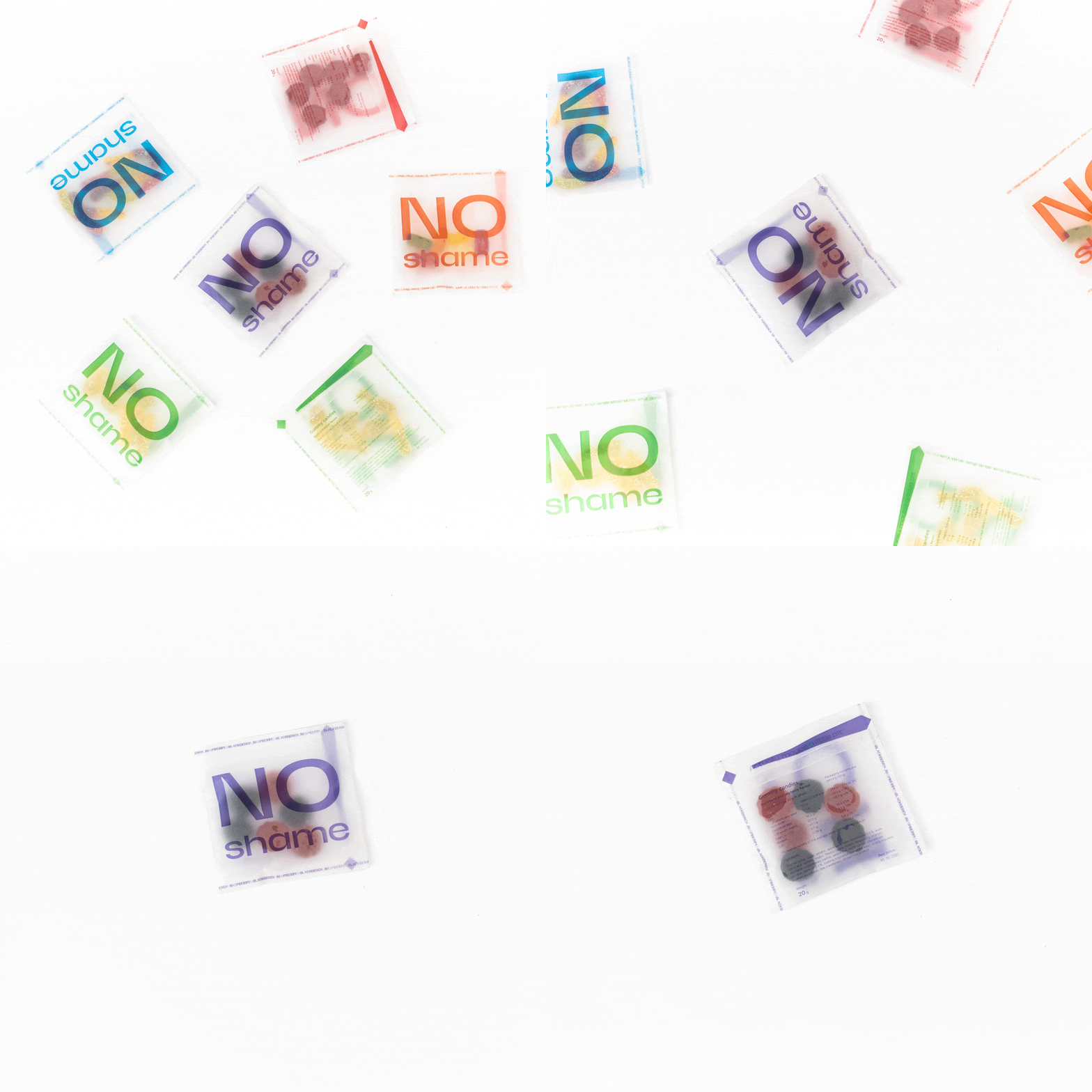
With this package of gummy candies, you don’t have to be ashamed of having a sweet tooth as an adult anymore. The market is full of gummy sweets with graphics designed for children. It is not a problem to find chocolate in a designed package, but with gum candies, the possibilities are much narrower. The package is made of translucent paper that supports the idea that there is no need to be ashamed - maybe just for how much you eat.
The jury appreciates the simple and effective graphic design printed on a transparent paper which completely replaces the plastics. The packaging design is suitable for other food as well as non-food products.
High School Category
Concepts by students of secondary and tertiary schools from 15 years of age.
Jiaozi
Lea Romanowská (CZE)
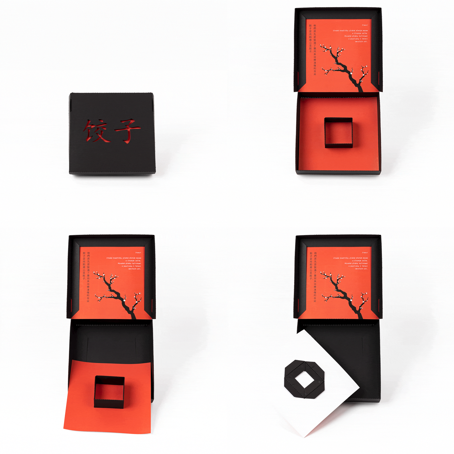
The model is a portable packaging for Chinese dumplings (jiaozi). The middle squared box is designed for a container with sauce and there is a space for 8 dumplings around it. The color palette highlights its minimalist style. The box consists of black construction with red paper inserted inside. The red paper peeks through the cut-out Chinese symbol for jiaozi 饺子 in the lid and informs about the dumplings' origin.
The jury appreciates elegant graphic design based on cutouts and interesting lid solution offering unique branding opportunities. The model shows high-level construction design with a simple inner fixation.
Calorie Cookies Package
Yoonsuh Lee (KOR)
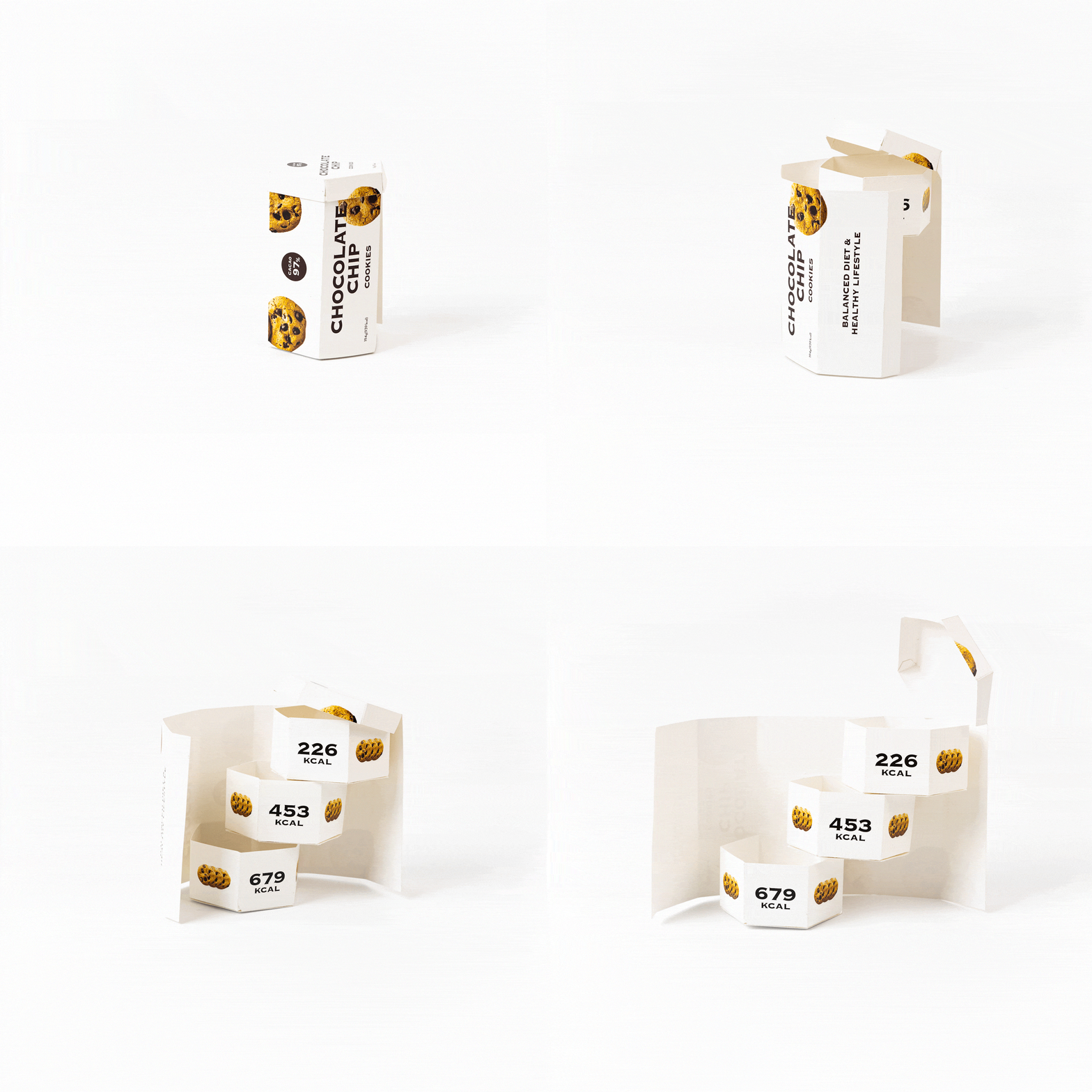
When you eat cookies, you will first think that you should only eat a specific amount. However, you will find an empty bag and start regretting it. And now, the “Calorie Cookie Package” will let you know how much you eat. The package is divided into three stages, and each stage indicates the calories you consume. It was planned and designed to let the customers eat cookies while checking the amount of calories in a healthy way without regrets.
The jury appreciates creative design with smart details and using only single material which is a sustainable solution. The model offers a unique and dramatic effect during its unboxing.
Eggs with a Story
Kateřina Hovorková (CZE)
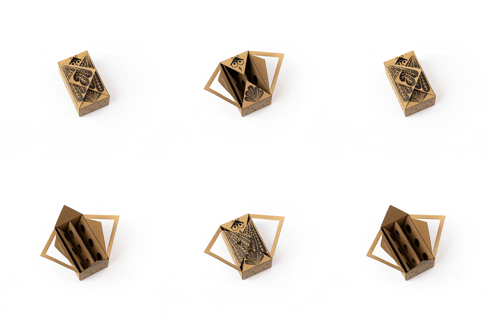
The aim of the egg box solution is to bring people back to nature. It should be clear at the first sight that the content of the box isn’t an industrially impersonal product but it’s the work of a living creature - a gift from nature to us. The box design forces the customer to think about the living conditions of chickens and influences them to prefer buying eggs from free breeding or bedding. The model is made of cardboard by using a laser and the print is created by linocut.
The jury appreciates creative design with smart cuts and construction which provides a great unboxing experience. The linocut technique of printing is very well made.
Special Prizes
Honorable awards for innovative or otherwise interesting prototypes.
un_pack_up
Agnieszka Jaskierska (POL)
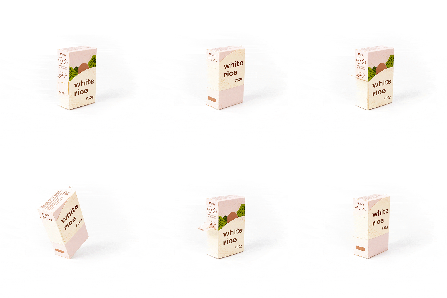
The author wanted to make rice packaging easier to handle for the elderly. Many of them have trouble opening packages with dry food because it easily spills everywhere. The model gives them the opportunity to regain self-confidence every day by fending for themselves. To pour rice from the package, you have to slide up the outer part of it. A unique lock also prevents accidental spillage and a small opening ensures that the rice is poured out at the right rate. In addition the materials of the final packaging are fully compostable.
The jury appreciates sustainable single material usage with the combination of opaque and transparent parts. And it appreciates functional and movable details which allow the user to measure the portion size.
Eggs with a Story
Kateřina Hovorková (CZE)
The aim of the egg box solution is to bring people back to nature. It should be clear at the first sight that the content of the box isn’t an industrially impersonal product but it’s the work of a living creature - a gift from nature to us. The box design forces the customer to think about the living conditions of chickens and influences them to prefer buying eggs from free breeding or bedding. The model is made of cardboard by using a laser and the print is created by linocut.
The jury appreciates creative design with smart cuts and construction which provides a great unboxing experience. The linocut technique of printing is very well made.
Spaghetti Packaging
Veronika Fejtová (CZE)
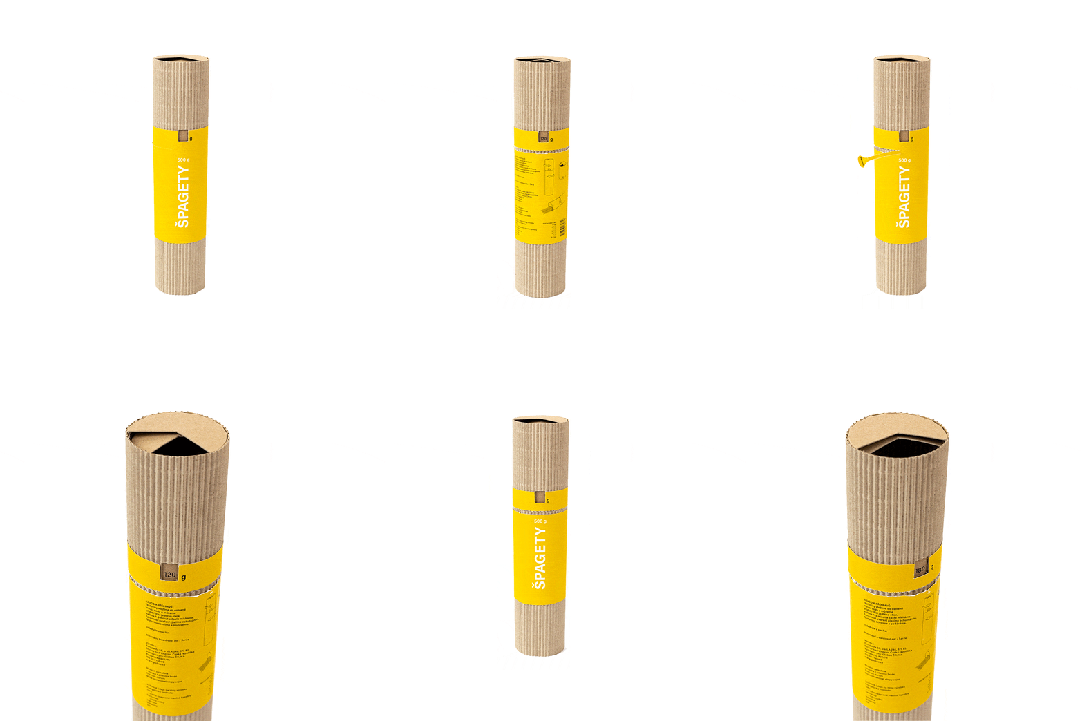
This package for spaghetti is a solution to the problem of measuring the right amount of the product and its storing after opening. The portioning is simply done by the measuring hole on the top part of the tube. And the bonus? The impractical plastic bag is replaced by the tube-shaped package which can be easily stored anywhere the whole package can be used as a travel pack.
The jury appreciates simple, eye catching and functional design with smart measuring and dosing features. The model is sustainable thanks to a single material usage.
Toothpicks
Tereza Cvrčková (CZE)
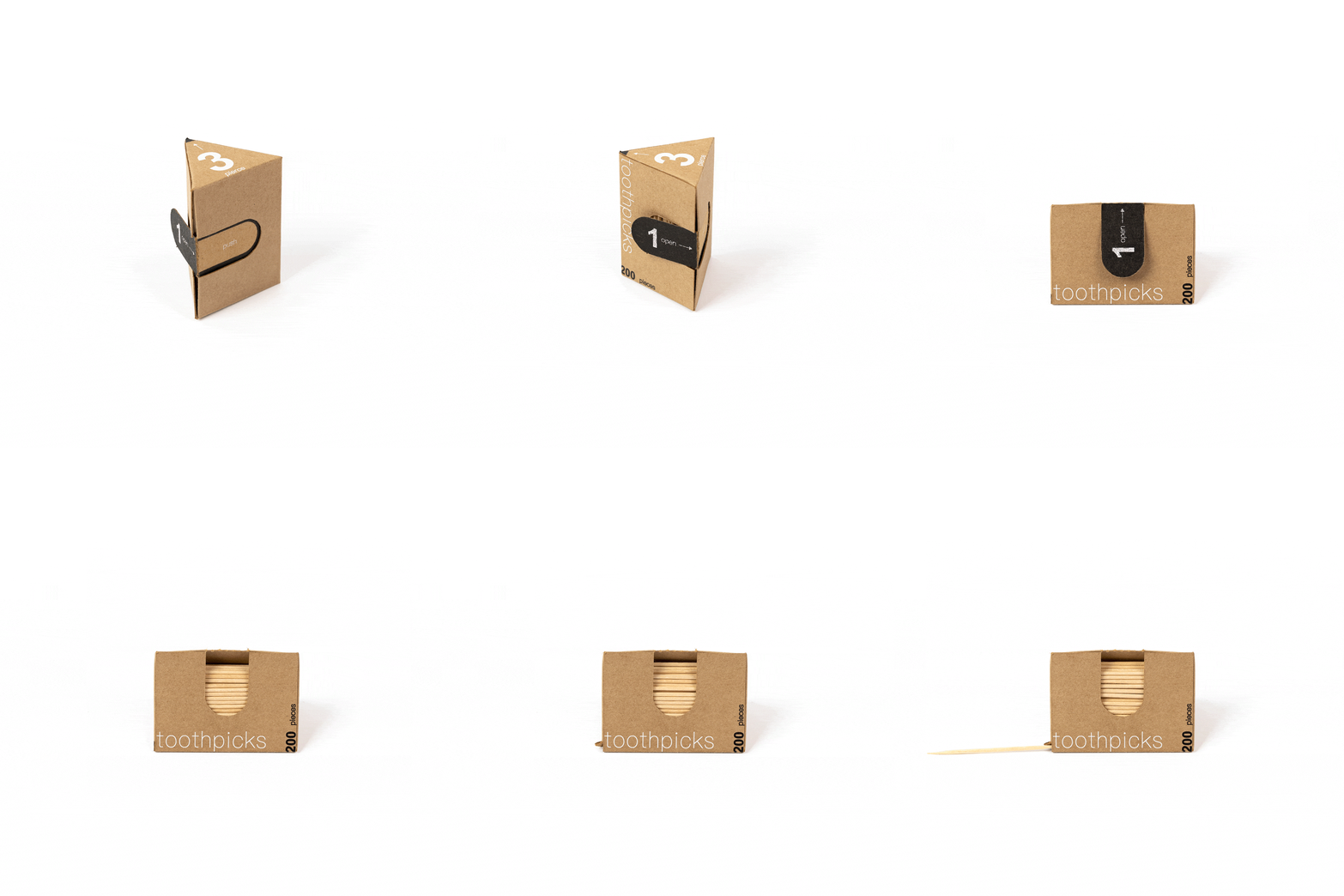
Food brings us joy until it’s somewhere we don’t want it to be - in our teeth it can be really uncomfortable… The paper package for toothpicks is made of one printed cut and it enables easier manipulation while taking out a piece. It’s simple to take a toothpick by using the back side of the box. Another way is to use a hole in the corner of the box where the user can easily get the last toothpick in a moment. Next to the easier manipulation, the model is also hygienic. Thanks to taking out a toothpick by touching its middle part the user doesn’t need to touch the tips which will go to the mouth. The tips are also protected from dust and any other dirt.
The jury appreciates the hygienic use without the need to wrap each piece separately, as well as simple, purposeful, cost-effective and functional design. The model shows precision and a creative approach.


-min.gif)
