Winning Concepts
The designers’ task was to design packaging for personal care products that would improve people’s everyday life and heal the ailments of today’s world.
Healthier, more beautiful, happier and responsible – that’s the model man of today who inevitably needs a lot of products and leaves a lot of packaging behind. All the things that we eat and drink every day, apply to our bodies, or simply use should improve our lives. All you have to do is choose either the path of natural products or the latest scientific knowledge. These products and their packaging enter our everyday lives with the ambition to make it better. Therefore, they should be better. Can designers make them better?
Designers can creatively and responsibly pack cosmetics, nutritional supplements (vitamins, teas), medical supplies, medicines or hygiene items of any kind.
University students and young designers of any age
Concepts by university students and designers of any age.
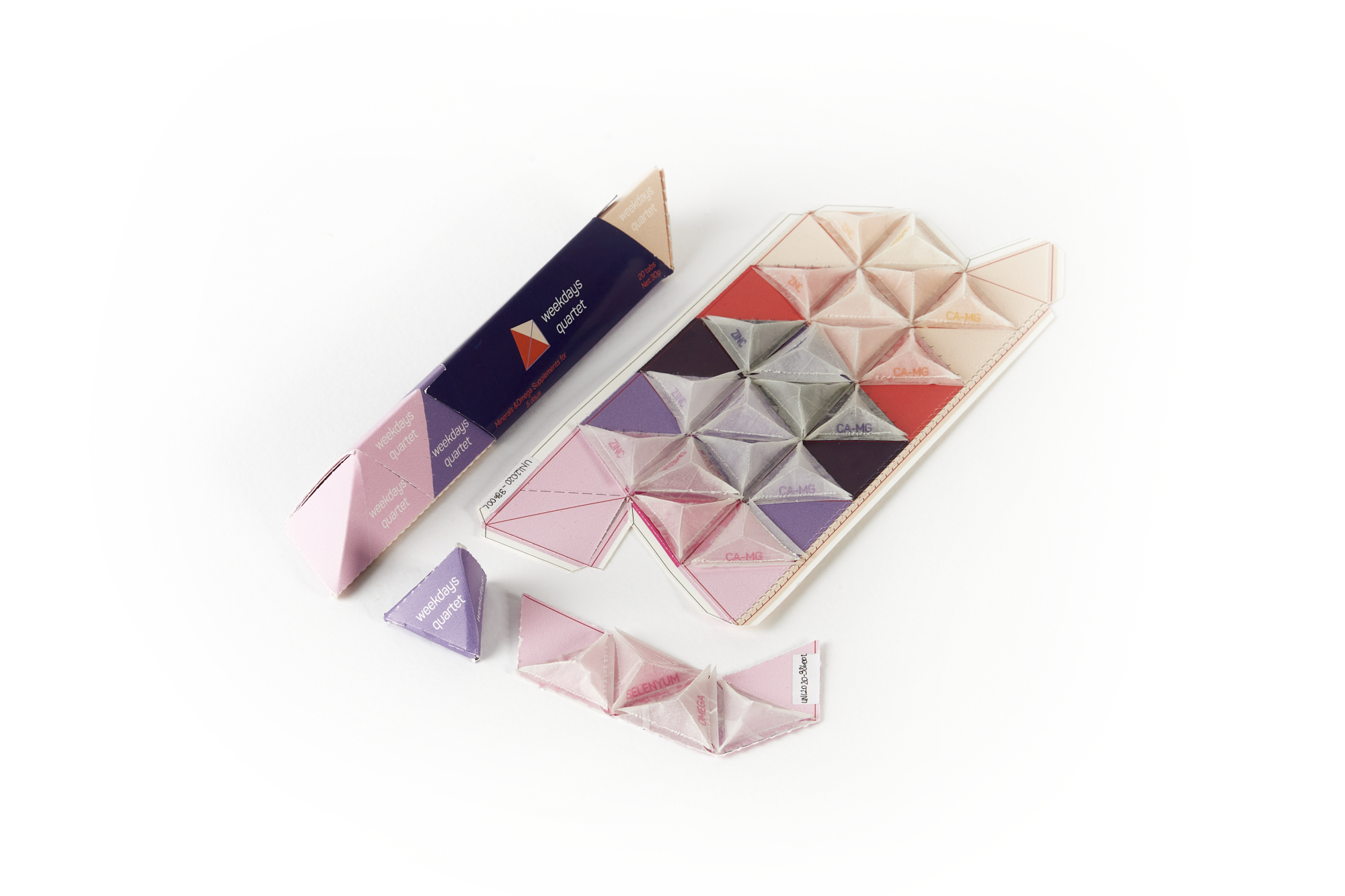
Weekdays Quartet
Öykü Aydınhan (TUR)
Weekdays Quartet is a set of food supplements (omega, magnesium-calcium, zinc, selenium), which an adult should consume on a daily basis. Öykü Aydınhan, following the example of her sister, who took supplements, saw how much packaging can affect the motivation to regular consumption. The supplements are usually sold in their own packaging in an impractical shape. The author, therefore, combined 4 different supplements into one packaging, which contains a dose for 5 days. It makes it easier to carry around and does not take up so much space. The dose for each day is in a separate module that can be torn off, so the packaging decreases with each day of consumption. The jury saw the artwork as a representative of the packaging future. This futuristic packaging is simple and solves a specific problem.
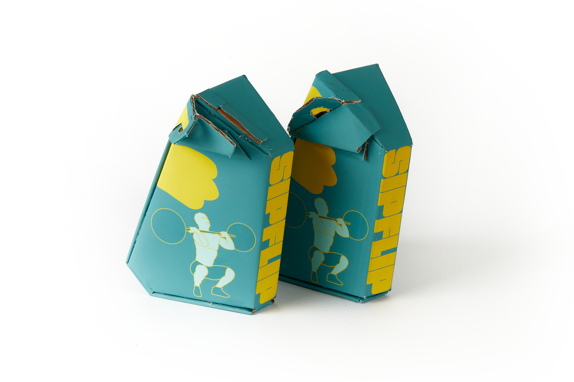
Sipflip
Kryštof Bouřil (CZE)
The author was inspired by his own experience with taking a loose food supplement, therefore he designed his work so that the packaging itself measures the daily dose in the most accurate and simplest way possible. It is not necessary to use another external measuring cup, often made of plastic. According to the jury, the packaging has a fantastic construction, but also appealing graphic design.
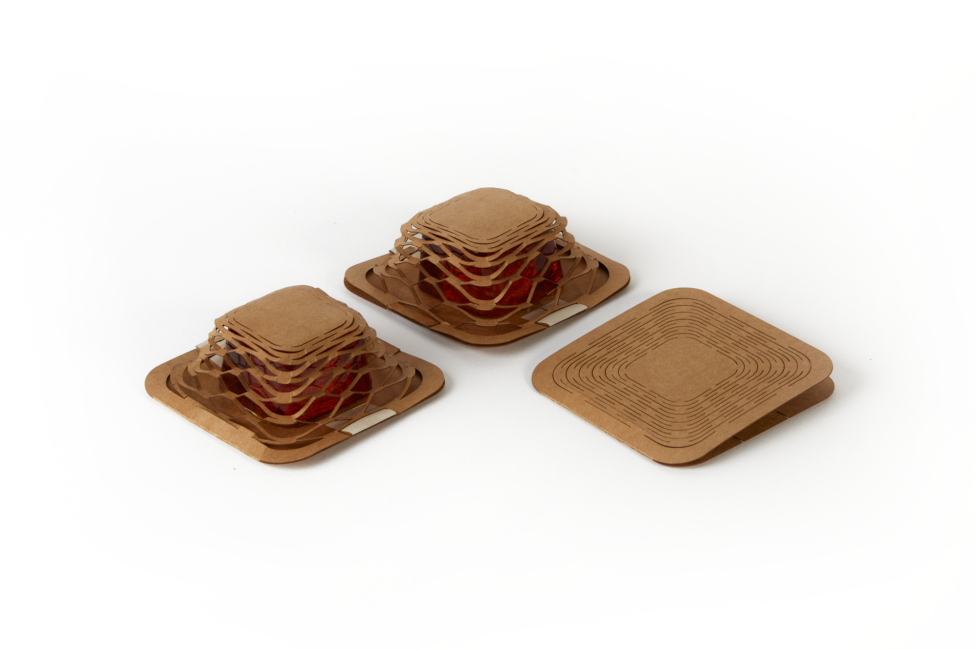
Less is More
Mao Jun Ren (TWN)
The packaging by Mao Jun Ren, which is inspired by the structure of honeycomb, does not need any glue, so it is also suitable for recycling. Simply cutting and assembling the paper creates a packaging that is not only ecological but also aesthetic. According to the jury, it meets the principles of sustainability. It is a unique solution in the context of soap that uses only a very small amount of packaging material. The product could also be really successful on the market, as it is a very attractive piece for the consumer.
Let it disappear
Natálie Štěpáníková (CZE)
The soap packaging for children by Natálie Štěpáníková is made of ecological water-soluble paper, thanks to which no waste is generated. The paper is 100% biodegradable and leaves no residue. Its water-solubility also does not prevent printing (eg with ecological ink) and thus does not limit the use of graphics on the packaging. The idea of “disappearing” of the packaging is further supported by a simple prank for children, who first assemble an origami flower from the packaging according to the instructions, place it on the water surface and the flower “disappears” in a moment. At the moment of dissolution, the folded pattern decomposes on contact with water, leaving only a color trace of ink. Magic!
Earth Palette
Veronika Janečková (CZE)
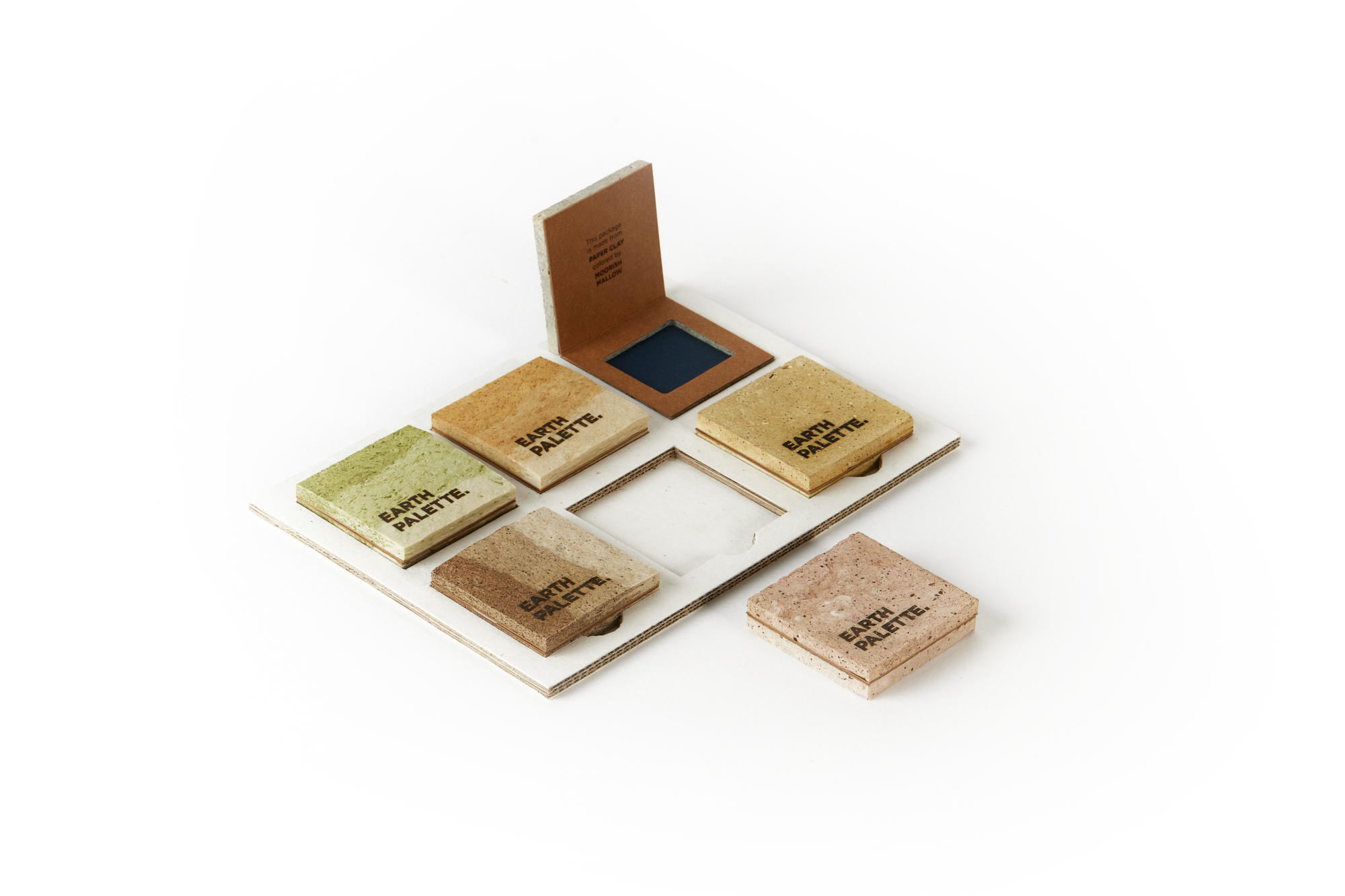
The ideas of ecology, zero waste or recycling were taken into account by Veronika Janečková during the designing process. She invented her own palette for decorative cosmetics, which can be used again and again until it disintegrates. The base of the packaging is made of paper, which is further dyed with natural pigments. Already in prehistoric times, people drew dyes from nature, and Veronica wanted to point out the magic of neglected natural resources and displace air-polluting materials. Each box contains a different pigment and thus acquires different properties, the one with the admixture of stone dust is logically stronger and harder than the one made of moss. This is transforming of paper into new material. The palettes are designed for eye shadow, blush or powder. Graphic design is simple, the beauty of the material is essential.
High schools
Concepts by students of secondary and tertiary schools from 15 years of age.
Squeeze Package
Soyoung Koo (KOR)
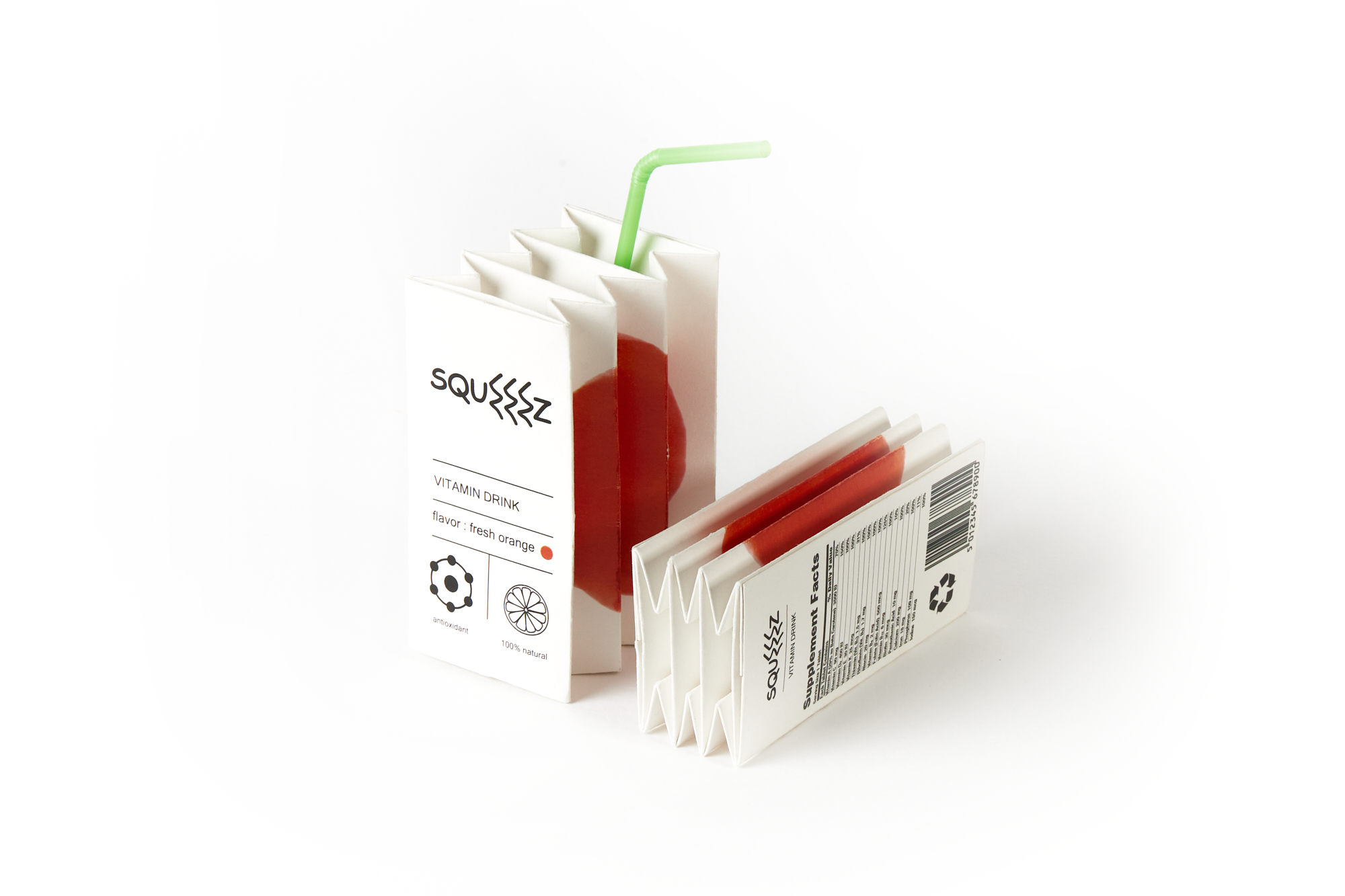
Japanese origami art inspired Soyoung Koo to create a packaging for a vitamin drink. After consumption, the package can be simply pressed into a thin layer, which saves space during subsequent manipulation. The packaging also shows a picture of the fruit whose flavour it contains. According to the jury, the design brings not only a bright idea but also has its logic and functionality. It looks authentic, has a high graphic level and the process of recycling of the packaging itself is obvious at first glance and very instructive for the consumer.
Howdy
Hyeseon Kim (KOR)
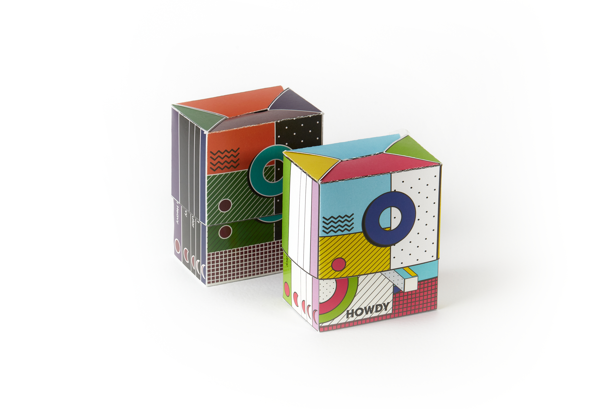
Howdy is a sanitary pads packaging that targets young girls, informing them about the menstrual cycle or what types of sanitary pads is more suitable to use. It builds on three principles: beauty, regularity, purity. The possibility of sliding out the package not only has the functionality for opening and closing but also serves as a space for additional information. This strong element of opening and closing makes the design special, at the same time it presents itself by an appealing graphic form using the composition of bold colours and geometric shapes.
Beauty Box
Lucie Trojanová (CZE)
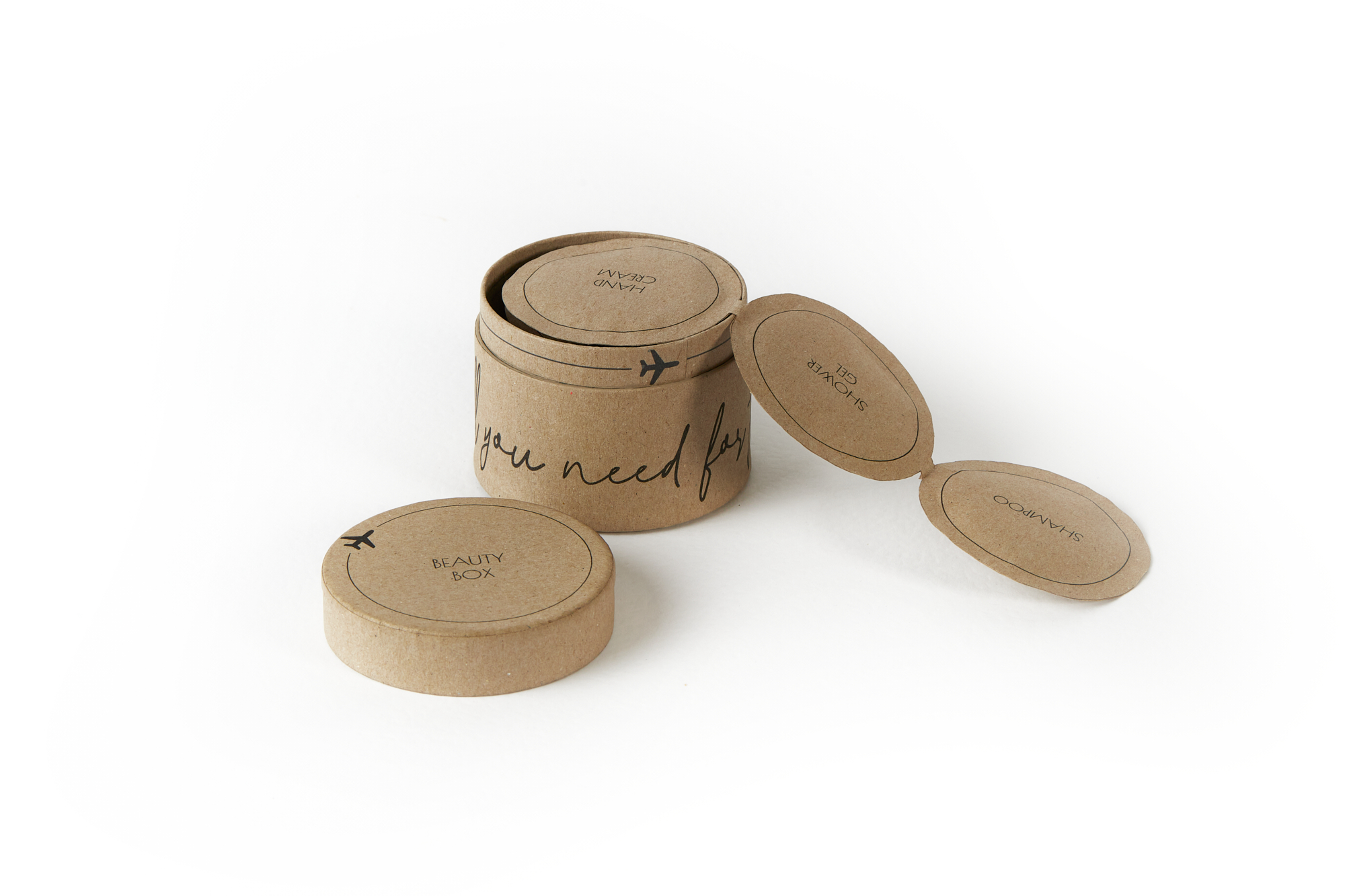
The author of the packaging, Lucie Trojanová, likes to travel, but she has a problem with how to pack all the most needed things quickly and efficiently. Therefore, she created a travel box made of paper with miniatures of the most necessary cosmetics, which could alternatively be used to present samples of new products of cosmetic brands. The jury appreciated that the simple packaging matches the fine graphics and is functional and plays nice with the paper.


.jpg)
